

User-first wayfinding starts with people, not panels
Walk into a busy store and watch people hesitate—then go left, then right. That hesitation costs time and sales, and it’s exactly what thoughtful retail signage aims to cut down. A user-centric approach studies real shoppers, then uses clear wayfinding cues—think simple directional signage and floor graphics—to guide routes. This isn’t about fancy tech for tech’s sake; it’s about removing friction so people move naturally. Smart fixtures and digital signage layer on where they actually help, not where they look neat.
Where real confusion shows up (and why)
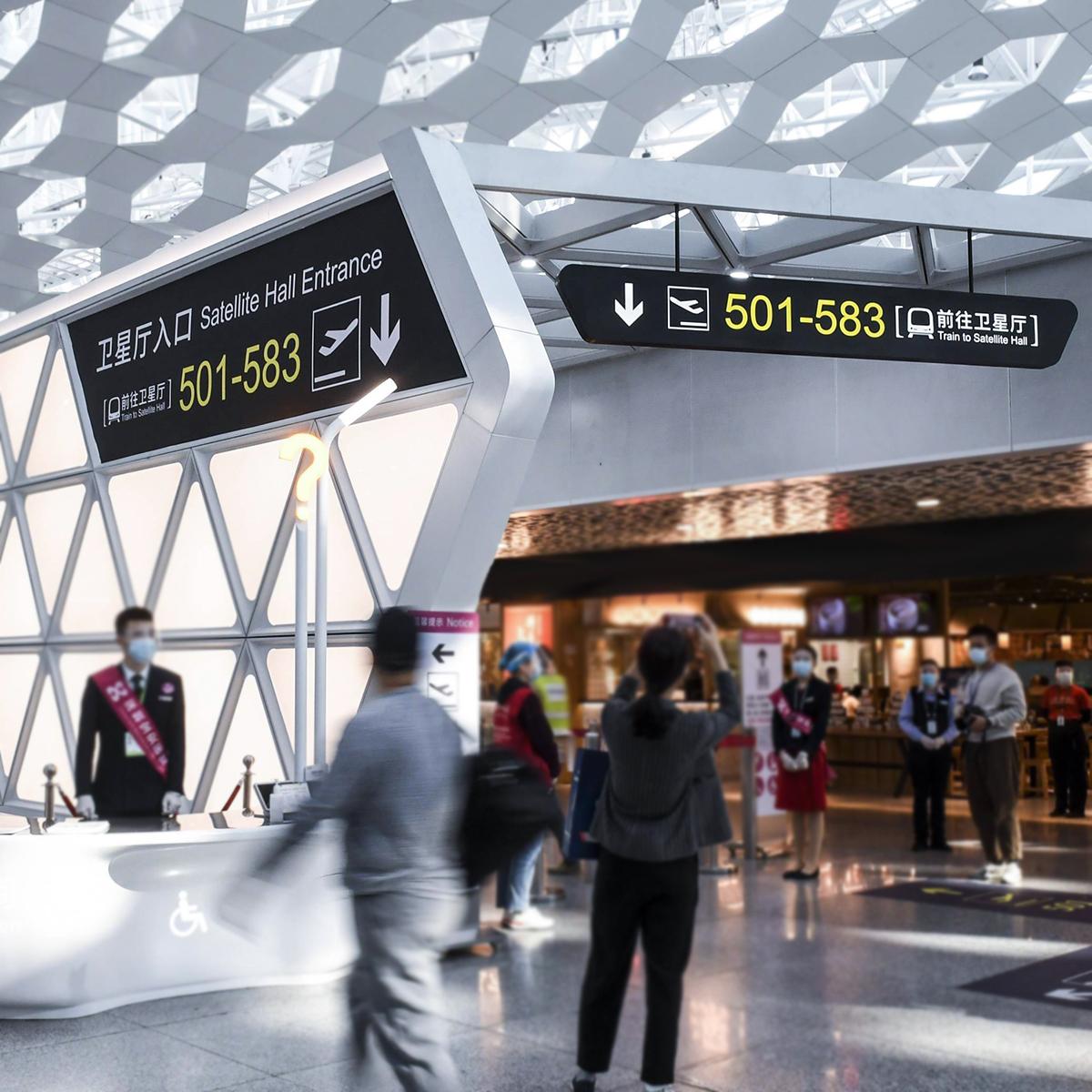
High-footfall hubs like Shinjuku Station show the truth: millions of people can move smoothly with the right visual cues. Retail spaces fail when sight lines break, product zones overlap, or visual hierarchy is missing. Shoppers pause when they can’t read a sign from 20 feet. They circle. They ask staff. That’s noise you can remove by designing paths for sight and intuition, and by placing primary directional signage at decision points.
Key user-centric rules for layout and signs
Start with a map of customer journeys. Pin the entrance, anchor destinations, and choke points. Then apply three practical moves: place high-contrast overhead signs for main aisles, use floor-level prompts near impulse zones, and add clear callouts for returns and checkouts. Visual hierarchy matters—size and contrast beat fancy fonts. Add ADA compliance where needed, and keep digital signage as a supplement, not the main route-maker.
Materials, placement, and tech that work
Choose materials that read under store lights: matte backgrounds, bold pictograms, and consistent sign family elements. Mount at consistent heights and align with sight lines from 10–30 feet. Use small loops of animation on digital signage to draw attention without distracting. Integrate beacon data or heatmaps if you can—those show real flow patterns and validate choices. Keep the systems simple; staff must be able to change a sign or swap an insert in minutes.

Common mistakes I’ve seen on the floor
Stores spend on illuminated displays but forget the basic route logic. Signs with too many words fail. Cluttered ceiling banners compete and cancel each other out. Once, during a remodel visit I saw half the wayfinding replaced with promotional posters—customers were more confused after. That one choice knocked down the visual hierarchy and turned direction points into ad space. Small fixes would’ve cut that confusion fast.
Testing, iteration, and quick wins
Run short A/B tests on real days. Swap a high-contrast overhead sign and compare dwell at adjacent fixtures. Track time-to-decision at key nodes. Use heatmap data or simple observation rounds. Minor things move the needle: adding a bold arrow at a decision point, aligning shelf faces to open sight lines, or reducing sign copy to two words. These shifts feel small but they change the shopper’s path—and the store’s conversion.
Three golden evaluation metrics
1) Decision Time: measure seconds from sight to committed direction at decision points. Lower is better. 2) Route Compliance: percent of shoppers who follow the intended circulation path; aim to increase this after sign changes. 3) Staff Interventions: count how often staff get asked for directions—fewer stops mean clearer signage. Use these metrics after each rollout and keep sign families consistent across stores.
Final take: focus on people, not fixtures. The right mix of directional signage, floor graphics, and modest digital elements fixes confusion fast and reliably. For practical, modular systems that scale across locations, Cosun Sign fits naturally into that workflow—smart, sturdy, and designed for real stores. —